# text
Element to display text on a page.
# Children Elements
This element supports a and span as children elements.
# Attributes
This element may contain the common attributes.
# CSS Properties
In addition to the common styles, this element supports the following styling properties:
linescolorletter-spacingfont-sizefont-stylefont-weighttext-decorationtext-indenttext-alignline-heighttext-overflowfont-family
This element supports the :active pseudo-class.
# lines
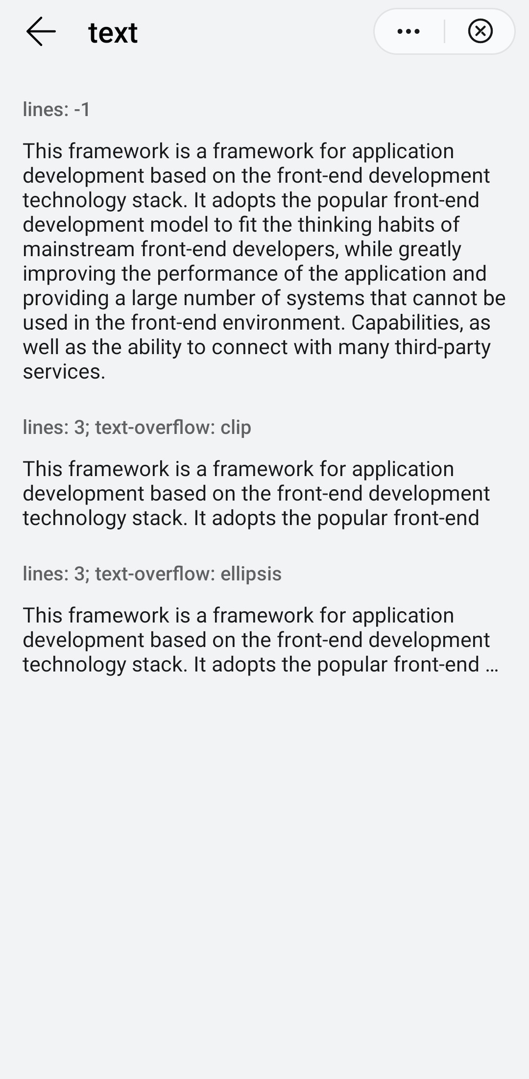
Number of text lines. The value -1 indicates unlimited lines.
- Type:
number - Default value:
-1 - Mandatory: no
# color
Color of the font.
- Type:
<color> - Default value:
rgba(0, 0, 0, 0.54) - Mandatory: no
# letter-spacing
Space between characters.
- Type:
<length> - Default value:
0px - Mandatory: no
# font-size
Font size.
- Type:
<length> - Default value:
30px - Mandatory: no
# font-style
Font style selected from the font family.
- Type:
string(italic|normal) - Default value:
normal - Mandatory: no
# font-weight
Weight of the font.
- Type:
string(lighter|100|200|300|400|500|600|700|800|900|normal|bold|bolder) - Default value:
normal - Mandatory: no
# text-decoration
Decoration options to the text.
- Type:
string(underline|line-through|none) - Default value:
none - Mandatory: no
WARNING
If you apply the text-decoration, you must set the value attribute.
# text-indent
- Type:
<length-percentage> - Default value: -
- Mandatory: no
# text-align
Alignment direction of the text, relative to its parent element.
- Type:
string(left|center|right) - Default value:
left - Mandatory: no
TIP
If you use different languages, using different directions, use this attribute together with dir.
# line-height
Line height of the text.
- Type:
<length> - Default value: -
- Mandatory: no
# text-overflow
Content shown if overflow is active. It takes effect when the number of lines is specified.
- Type:
string(clip|ellipsis) - Default value:
clip - Mandatory: no
# font-family
Font family of for the text.
- Type:
string - Default value: -
- Mandatory: no
To customize fonts, please refer font-face style.
# Events
This element supports the common events.
# Methods
This element does not have additional methods.
# Example
This example uses internationalization resources to simplify readability of the example.
<template>
  <div class="container">
    <div class="case-title mt-item">
      <text class="title">lines: -1</text>
    </div>
    <div class="mlr-container">
      <div>
        <text class="text-one color-primary">{{$t('message.component.text.sampleText')}}</text>
      </div>
    </div>
    <div class="case-title mt-item">
      <text class="title">lines: 3; text-overflow: clip</text>
    </div>
    <div class="mlr-container">
      <div>
        <text class="text-two color-primary">{{$t('message.component.text.sampleText')}}</text>
      </div>
    </div>
    <div class="case-title mt-item">
      <text class="title">lines: 3; text-overflow: ellipsis</text>
    </div>
    <div class="mlr-container">
      <div>
        <text class="text-three color-primary">{{$t('message.component.text.sampleText')}}</text>
      </div>
    </div>
  </div>
</template>

<style lang="sass">
  .text-two {
    lines: 3;
  }
  .text-three {
    lines: 3;
    text-overflow: ellipsis;
  }
</style>