# rating
Star-based rating input field.
# Children Elements
This element doesn't support any element as child node.
# Attributes
In addition to the common attributes, this element may contain the following attributes.
# numstars
This attribute indicates the number of star elements to be displayed on a rating bar.
- Type:
number - Default value:
5 - Mandatory: no
# rating
The current value with the number of selected stars.
- Type:
number - Default value:
5 - Mandatory: no
# stepsize
This attribute indicates the size of the steps for the rating.
- Type:
number - Default value:
0.5 - Mandatory: no
# indicator
Flag to indicate if rating field is editable (false) or not (true).
- Type:
boolean - Default value:
false - Mandatory: no
# CSS Properties
In addition to the common styles, this element supports the following styling properties:
This element supports the :active pseudo-class.
# star-background
Background image of the selectable element (when it is not selected). The URI specified in this element may contain either a local resource or a base64-encoded image.
- Type:
uri - Default value: -
- Mandatory: no
# star-foreground
Image of the selectable element when it's selected. The URI specified in this element may contain either a local resource or a base64-encoded image.
- Type:
uri - Default value: -
- Mandatory: no
# star-secondary
Secondary image of the selectable element when it's selected. The URI specified in this element may contain either a local resource or a base64-encoded image.
- Type:
uri - Default value: -
- Mandatory: no
# width
Attribute that indicates the width of the stars rating bar.
- Type:
string(<length>|<percentage>) - Default value: (
numstarsvalue x width of a star) - Mandatory: no
# height
Height of a star.
- Type:
string(<length>|<percentage>) - Default value: (height of a star)
- Mandatory: no
# Events
This element supports the common events, with the exception of click, longpress, and swipe. In addition to this, this element supports the following event:
# change
This event is triggered when the current value of a rating input changes.
Additional parameters:
{ rating: number }
# Methods
This element does not have additional methods.
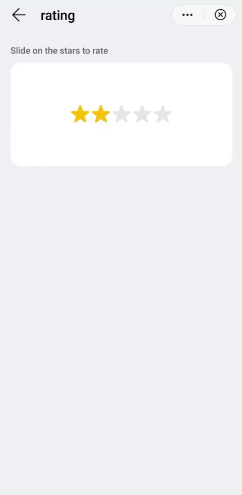
# Example
<template>
  <div class="container">
    <div class="case-title mt-item">
      <text class="title">Slide on the stars to rate</text>
    </div>
    <div class="item-container rating-container row-center column-center">
      <rating class="ratingStyle" rating="2"></rating>
    </div>
  </div>
</template>

<style lang="sass">
  .rating-container {
    height: 320px;
  }
  .ratingStyle {
    star-background: url(/Common/img/ic_stars_gray_mid.png);
    star-foreground: url(/Common/img/ic_stars_blue_mid.png);
    star-secondary: url(/Common/img/ic_stars_blue_half_mid.png);
    height: 64px;
  }
</style>