# Manifest
Every quick app contains a manifest.json document in its root directory. This JSON file contains metadata relative to the app, like textual and graphical descriptions, technical information, including versioning, platform requirements, API and permissions required, and routing.
Example of a quick app manifest:
{
  "package": "org.example.myquickapp",
  "name": "My First Quick App",
  "icon": "/Common/icon.png",
  "versionName": "1.0",
  "versionCode": 1,
  "minPlatformVersion": 1000,
  "features": [
    {
      "name": "system.geolocation"
    }
  ],
  "permissionDesc": [
    {
      "name": "ACCESS_FINE_LOCATION",
      "desc": "We need your position to suggest the nearest place."
    }
  ],
  "config": {
    "logLevel": "info"
  },
  "router": {
    "entry": "Hello",
    "pages": {
      "Hello": {
        "component": "hello",
        "path": "/",
        "filter": {
          "view": {
            "uri": "https?://.*"
          }
        }
      }
    }
  },
  "display": {
    "backgroundColor": "#ffffff",
    "fullScreen": false,
    "titleBar": true,
    "titleBarBackgroundColor": "#000000",
    "statusBarImmersive": true,
    "statusBarTextStyle": "auto",
    "statusBarBackgroundColor": "#ffffff",
    "pages": {
      "Hello": {
        "backgroundColor": "#eeeeee",
        "fullScreen": true,
        "titleBarBackgroundColor": "#0000ff",
        "titleBarText": "Hello"
      }
    }
  },
  "subpackages": [
    {
      "name": "pkgA",
      "resource": "PackageA"
    },
    {
      "name": "pkgB",
      "resource": "PackageB"
    }
  ],
  "trustedSslDomains": [
    "https://example.org",
    "example.com"
  ]
}
The quick app manifest is a JSON document with mandatory and optional members that serve to configure and describe the app.
The manifest may contain the following members:
# package
Package identifier
- Type:
string - Value by default: N/A
- Required: yes
Values for the package identifier may contain 255 alphanumeric characters, including period (.) and underscore (_) characters.
Values must always start with an alphabetic character. The last character cannot be a period (.) character that is usually used to separate the entities to identify the developer or the publisher of the application, following the structure xxx.domain.project.
Example
{
  "package": "org.example.myquickapp"
}
# name
Name of the app
- Type:
string - Value by default: N/A
- Required: yes
This member represents the app's title, and it is usually displayed by the device's system on the home screen and in notifications. Marketplaces also show it to the users as a human-readable identifier for the application.
This member supports internationalization, by referring to a concrete localization variable. For instance, "name":"${message.appname}" .
Example
{
  "name": "My First Quick App"
}
WARNING
Complex localization operations are not supported, like the following examples:
- Combination of static and internationalized strings. (Wrong) example:
"name":"Quick app example${message.appname}". - Combination of multiple internationalized variables. (Wrong) example:
"name":"${message.appname1}${message.appname2}".
# icon
Icon of the app
- Type:
string - Value by default: N/A
- Required: yes
Icons are used by device systems to represent the app along with the name. Marketplaces use icons to display the apps on their app catalogs.
Example
{
  "icon": "/Common/icon.png"
}
# versionName
Human-readable version
- Type:
string - Value by default: N/A
- Required: no
a human-readable version of the app. The recommended format is X.Y.Z, where X, Y, and Z are non-negative integer values (e.g., 1.10.0), as specified in the Semantic Versioning (opens new window) specification.
Example
{
  "versionName": "1.0"
}
# versionCode
Internal version code
- Type:
integer - Value by default: N/A
- Required: yes
Numeric app version identifier. This member supports non-negative integers and usually refers to correlative incremental codes, starting at version 1.
Example
{
  "versionCode": 1
}
# minPlatformVersion
Minimum platform (engine) required
- Type:
integer - Value by default:
1000 - Required: yes
Minimum supported version of the quick app engine. This member includes a non-negative integer that indicates the minimum version of the engine to ensure the correct operation of a quick app.
The minimum version guarantees the availability and compatibility of the native APIs and services used by the app.
Example
{
  "minPlatformVersion": 1000
}
# features
List of features and services
- Type:
array - Value by default: N/A
- Required: no
List of permissions required by the app. The APIs used during the execution of a quick app must be declared in advance using this member. This member contains an array of objects. Each object must have a name member, whose value represents the service, using the corresponding identifiers (see API reference).
Example
{
  "features": [
    {
      "name": "system.app"
    },
    {
      "name": "system.network"
    }
  ],
}
# permissionDesc
Permission description
- Type:
array - Value by default: N/A
- Required: no
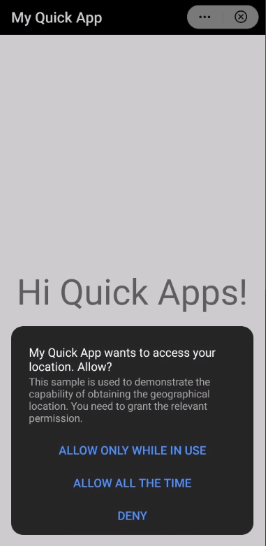
The rationale for requesting the permissions in the features member. This member is used to inform users about the purpose of the privilege requests when the system prompts the authorization dialogs.
The value of the permissionDesc member is an array of objects with a list of system privileges to be requested by the app and the rationale behind these requests shown to the end-users.
This member is an array of objects that contain two members:
name, to specify the concrete permission to be requested using the following reserved strings:WRITE_CALENDAR,ACCESS_FINE_LOCATION,CAMERA,RECORD_AUDIO,WRITE_EXTERNAL_STORAGE,STORAGE_READ,READ_PHONE_STATE,NOTIFYCATION,SILENT_NOTIFYCATION, andREAD_CONTACT
descwith a descriptive text with the information (supporting the internationalization of the values).
WARNING
Complex localization operations are not supported, like the following examples:
- Concatenation of a string and an internationalization variable. (Wrong) example:
"desc": "The reason is ${message.permissionDesc}". - Concatenation of an internationalization variables. (Wrong) example:
desc": "${message.permissionDesc}${message.permissionDesc1}". - Accessing a JSON element without using the dot (
.) notation. (Wrong) example:"desc": "The reason is: ${message['permissionDesc']}".
Example
{
  "permissionDesc": [
    {
      "name": "ACCESS_FINE_LOCATION",
      "desc": "This sample is used to demonstrate the capability of obtaining the geographical location. You need to grant the relevant permission."
    },
    {
      "name": "RECORD_AUDIO",
      "desc": "${message.permissionDesc}"
    }
  ]
}
# config
Configuration of the system
- Type:
object - Value by default: N/A
- Required: yes
This member is an object that includes global setup variables and data for the app.
The config object supports the following members:
# logLevel
Logging level
- Type:
string - Value by default:
log
The value of this member defines the logging level during the execution of the app.
The options allowed are:
off,error,warn,info,log(default), anddebug.
Example
{
  "config": {
    "logLevel": "info"
  }
}
# designWidth
Reference design width of the viewport
- Type:
stringorinteger - Value by default:
750
Width of reference for the page design. The value of this member includes the width of reference that will be used to scale the in-app components size and adjust them to specific designs.
The value must be either a non-negative integer that represents the width of the visual viewport in dp (density pixels) units or the string device-width, indicating the width of the visual viewport.
Example
{
  "config": {
    "designWidth": "device-width"
  }
}
# data
Global data
- Type:
object
The value of this member is an object that can be globally accessed from any quick app page through the keyword this.
The object may contain key/value pairs, whose keys are strings that cannot start with a dollar sign ($) or the underscore (_) characters.
Every page also has a similar data variable but with local scope. If the global and the local data object variables contain the same key, the global variable overrides the local one during the page initialization.
Example
{
  "config": {
    "data": {
        "currency": "EUR",
        "category": "cat1"
    }
  }
}
# network
Network timeouts configuration
- Type:
object
This member contains an object to configure the timeout for the network functions such as resource fetch and upload (through the system.fetch, system.request.upload(), and system.websocketfactory functions).
The network object supports the following members:
# connectTimeout
Connection timeout
- Type:
number - Value by default:
30000
Optional member to define the maximum elapsed time allowed (in milliseconds) for establishing a network connection from the app.
Example
{
  "config": {
    "data": {
      "network": {
        "connectTimeout": 35000
      }
    }
  }
}
# readTimeout
Reading timeout
- Type:
number - Value by default:
30000
Optional member to define the maximum elapsed time (in milliseconds) allowed for reading network streams from the app.
Example
{
  "config": {
    "data": {
      "network": {
        "readTimeout": 35000
      }
    }
  }
}
# writeTimeout
Writing timeout
- Type:
number - Value by default:
30000
Optional member to define the maximum elapsed time (in milliseconds) allowed for writing network streams from the app.
Example
{
  "config": {
    "data": {
      "network": {
        "writeTimeout": 35000
      }
    }
  }
}
# background
Services running in background
- Type:
object
This member includes an object with an array of features, with the APIs used by the app that can run in the background. The APIs included in this member need to be also defined in the main features member.
The supported APIs that can run in background are:
system.audio: Audio player.system.record: Audio recording.system.request: Uploading/downloading data.system.geolocation: Get the location.
Example
{
  "config": {
    "background": {
      "features":[
        "system.request",
        "system.geolocation"
      ]
     }
  }
}
Read more about quick app services running in background.
# recreateOnFolding
Refresh content in folding devices
- Type:
boolean - Value by default:
true
This member is a boolean that indicates whether the system must reload the current page when a foldable screen changes its status (i.e., folded/unfolded).
The options are:
trueto reload the page. The effect is the same as that when a user opens the current page for the first time (the system triggers the lifecycle events init, ready, and show). See more about lifecycle events.falseto avoid the refresh of the page.
Example
{
  "config": {
    "recreateOnFolding": false
  }
}
# router
Page routing configuration
- Type:
object - Required: yes
This member contains information about the routes of the different pages of the app.
The router object contains the following members:
# entry
Home page
- Type:
string - Required: yes
This router's attribute specifies the string that identifies the page that will be used as the entry page of the app.
Example
{
  "router": {
    "entry": "Hello"
  },
}
# errorPage
Error page
- Type:
string - Required: no
This router's attribute specifies the identifier of a page to be displayed when an internal error occurs (e.g., a page is not found in the app package).
The error page needs to be registered as the rest of the pages within the router's page attribute.
If errorPage is not specified or the identifier set is not included in the router's page list, the system will use a default error page.
NOTE
The launch mode of the default error page is singleTask. When the system displays the default error page and there are no more pages in the page stack, the back button will redirect to the home page (entry member).
Example
{
  "router": {
    "errorPage": "Error"
  },
}
# pages
Configuration of the app pages
- Type:
object - Required: yes
This member includes information about all the pages of an app. The router's pages member is an object whose keys are strings with unique page identifiers. The value of each key (the page identifier) is an object with the details of the page configuration, including the location in the package and the name of the main component.
The pages object contains the following members:
# component
Component name
- Type:
string - Value by default: N/A
- Required: yes
This member includes the name of the component corresponding to the page. The identifier must be the same as the UX file name that contains the page (e.g., a component identified as hello corresponds to the hello.ux filename).
Example
{
  "router": {
    "pages": {
      "Hello": {
        "component": "hello"
      }
    }
  },
}
# path
Page component path
- Type:
string - Value by default:
/ - Required: no
This member specifies the absolute path of the page in the app package (e.g., /user).
If the value is not set, the system will use the page identifier as default directory (i.e., /<component>). For example, in the configuration "Index": {"component": "index"}, the path is set to /Index by default.
Example
{
  "router": {
    "pages": {
      "Hello": {
        "component": "hello",
        "path": "/"
      }
    }
  },
}
# filter
Network requests filter
- Type:
object - Value by default: N/A
- Required: no
Allowed network requests. This member includes an object with the HTTP(S) actions that are allowed on a page. Based on the values of this member, the system filters the access to external resources for each page.
The structure of a filter object contains a view object that is defined as follows:
"filter": {
  "view": {
    "uri": "<pattern>"
  }
}
The value of the uri member is a regular expression that includes the filtering rule that must match the URI for requesting data.
Example
{
  "router": {
    "pages": {
      "Hello": {
        "filter": {
          "view": {
            "uri": "https?://.*"
          }
        }
      }
    }
  },
}
The page can obtain the page access parameters from the $page variable.
# launchMode
Page launch mode
- Type:
string - Value by default:
standard - Required: no
This member specifies how the system must open the page in terms of lifecycle events.
The launchMode attribute supports two different values: standard and singleTask.
standard. Using this value, the system creates a new page instance every time a user accesses the page.singleTask. Using this value, the system opens the existing instance of the page every time a user opens the page. It triggers therefreshevent to remove other pages launched through this page. If it is the first time the page is launched, the system creates one page instance.
NOTE
The home page (entry) only supports the singleTask mode.
Example
{
  "router": {
    "pages": {
      "Hello": {
        "launchMode": "standard"
      }
    }
  },
}
See more details and examples of page launch mode on the lifecycle section.
# display
User interface configuration
- Type:
object - Value by default: N/A
- Required: no
Configuration of the user interface. This member includes details to configure the look and feel of the app, like the theme, colors, menu, and title.
The display object contains the following members:
backgroundColorfullScreentitleBartitleBarBackgroundColortitleBarTextColortitleBarTexttitleBarBackgroundOpacitymenuwindowSoftInputModepagesorientationstatusBarImmersivestatusBarTextStylestatusBarBackgroundColorstatusBarBackgroundOpacitytextSizeAdjustmenuBarData
NOTE
Smart displays usually support only full-screen and landscape modes, so fullScreen must be set to true, and orientation must be set to landscape. Title bar-related attributes are not supported.
# backgroundColor
Background color
- Type:
string(simple color (opens new window)) - Value by default:
#ffffff(#121212in car head units)
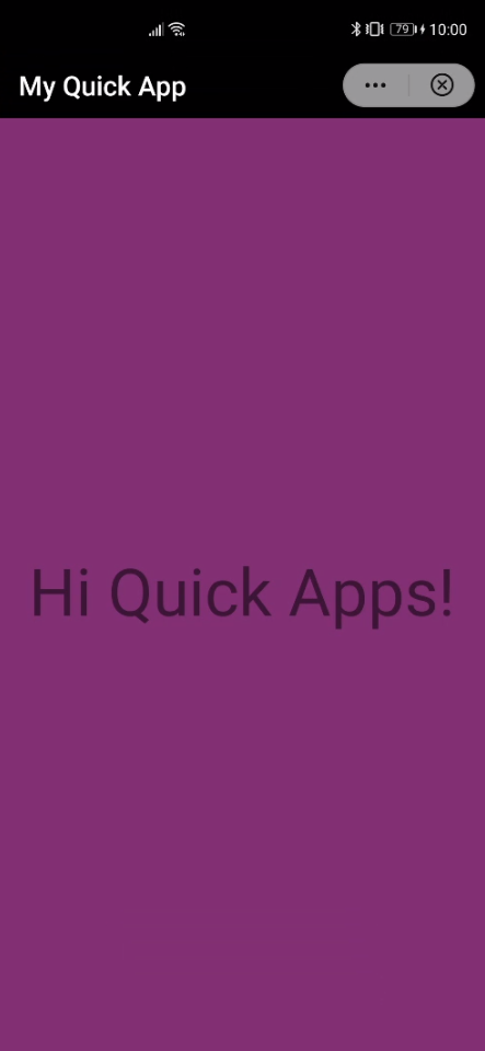
The value of this member is a string that specifies the background color of the app in format.
Example
{
  "display": {
    "backgroundColor": "#833075"
  }
}
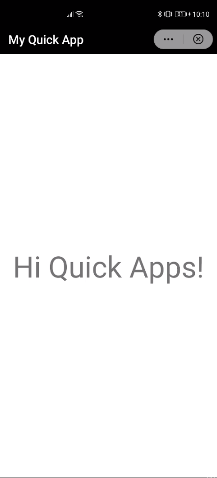
# fullScreen
full-screen mode
- Type:
boolean - Value by default:
false
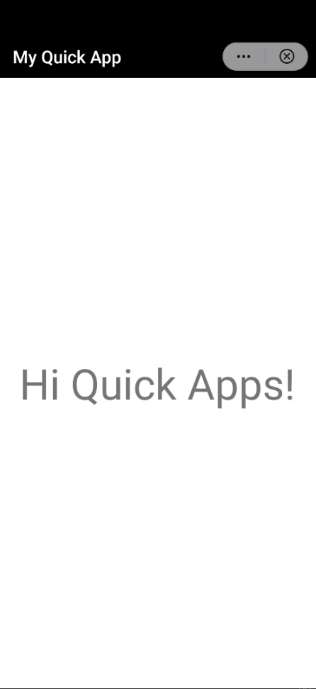
Full-screen mode. If the value of this member is true, the app will be run in full-screen mode, hiding the status bar.
NOTE
The title bar is displayed by default and managed by the titleBar member.
Examples
{
  "display": {
    "fullScreen": true
  }
}
The app is displayed in full screen:
{
  "display": {
    "fullScreen": false
  }
}
The result is:
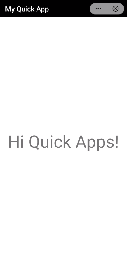
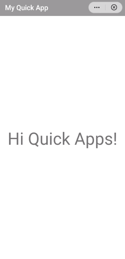
# titleBar
title bar display
- Type:
boolean - Value by default:
true
Title bar display. This member indicates whether to display the title bar (true) or not (false).
Title bar displayed:
Example
{
  "display": {
    "titleBar": true
    }
  }
}
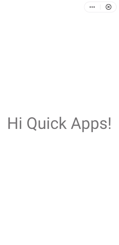
Title bar hidden:
{
  "display": {
    "titleBar": false
    }
  }
}
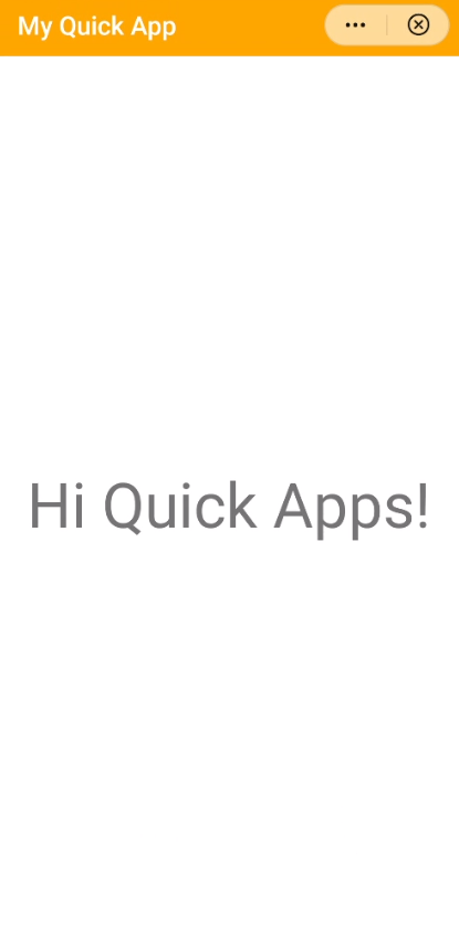
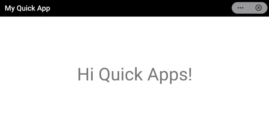
# titleBarBackgroundColor
Title bar background color
- Type:
string(simple color (opens new window)) - Value by default:
- Dark theme:
#000000 - Light theme:
#ffffff
- Dark theme:
The background color of the title bar. The value of this member is a string that specifies the background color of the app title bar.
Example
{
  "display": {
    "titleBarBackgroundColor": "orange"
  }
}
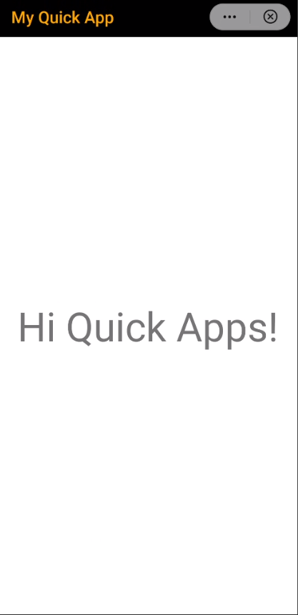
# titleBarTextColor
title bar text color
- Type:
string - Value by default: N/A
Text color of the title bar. The value of this member is a string that specifies the foreground color of the title bar of the app.
Example
{
  "display": {
    "titleBarTextColor": "orange"
  }
}
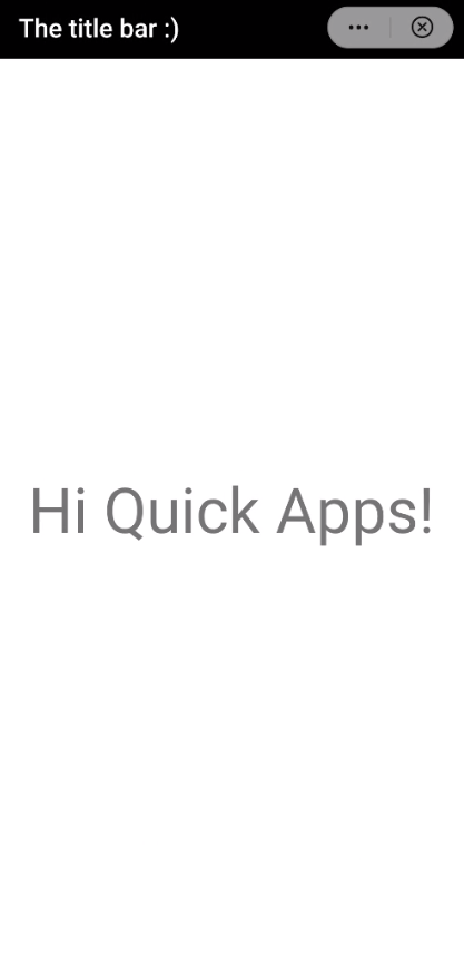
# titleBarText
Content of the title bar
- Type:
string
Text of the title bar. The value of this member is a string that specifies the content of the title bar. This value may also be set up during the app's execution through the titleBarText parameter passed during the page routing.
Example
{
  "display": {
    "titleBarText": "The title bar :)"
  }
}
# titleBarBackgroundOpacity
Title bar transparency level
- Type:
decimal - Value by default:
1.0
The value of this member is a decimal number from 0 to 1 that defines the transparency of the title bar (i.e., 0 for transparent, 1.0 for opaque).
Example
{
  "display": {
    "titleBarBackgroundOpacity": 0.4
  }
}
# menu
System's (quick app) menu
- Type:
boolean - Value by default:
false
This member is a boolean that specifies whether the system's quick app menu icon is shown or not.
WARNING
This attribute is deprecated. Menus are fixed and cannot be customized. Use the configuration of the system instead.
Example
{
  "display": {
    "menu": false
  }
}
# windowSoftInputMode
Virtual keyboard adjustment
- Type:
string - Value by default:
adjustPan
This member indicates the mode of adjusting the page to ensure that the app content is visible when the virtual keyboard is displayed. The possible values are:
adjustPan. It moves the content of the page up to accommodate the virtual keyboard.adjustResize. It compresses the display area of the page. This configuration is ignored when the page is displayed in full-screen mode.
Example
{
  "display": {
    "windowSoftInputMode": "adjustResize"
  }
}
# pages
Page display options
- Type:
object
This attribute is an object with keys as the page identifiers (the same identifiers as stated in the route member). The value of each page's key contains an object with the page's style, overriding the app's default style.
Example
{
  "display": {
    "pages": {
      "Hello": {
        "backgroundColor": "#eeeeee",
        "fullScreen": true,
        "titleBarBackgroundColor": "#0000ff",
        "titleBarText": "Hello"
      }
    }
  }
}
# orientation
Display orientation
- Type:
string - Value by default:
portrait
The value of this member specifies the display orientation of the app pages (i.e., landscape and portrait). The possible values are:
portrait. Force the portrait mode.landscape. Force the landscape mode.auto(1070+): The orientation is based on the system auto-rotate settings.
NOTE
After rotation, the dimensions of the page may change. If this orientation is set to auto, the app should be designed following a responsive layout for a smooth user experience.
Example
{
  "display": {
    "orientation": "landscape"
  }
}
# statusBarImmersive
Status bar transparency
- Type:
boolean - Value by default:
false
This member indicates whether to display the translucent status bar (true) or not (false).
Example
{
  "display": {
    "statusBarImmersive": true
  }
}
# statusBarTextStyle
Status bar theme
- Type:
string - Value by default:
auto
Text style of the status bar. This member specifies the theme (i.e., light, dark) of the status bar. If the value is set to auto, the style will automatically adjust based on the status bar background color.
NOTE
Currently, Huawei Quick Apps only supports the auto value.
Example
{
  "display": {
    "statusBarTextStyle": "light"
  }
}
# statusBarBackgroundColor
Status bar background color
- Type:
string(simple color (opens new window)) - Value by default: (same as title bar background color)
The background color of the status bar. The value of this member is a string that specifies the background color of the status bar of the app. The default value is the same as the background color of the title bar.
Example
{
  "display": {
    "statusBarBackgroundColor": "#ff0000"
  }
}
# statusBarBackgroundOpacity
Status bar transparency
- Type:
decimal - Value by default: (same as transparency of the title bar)
The value of this member is a decimal number from 0 to 1.0 that defines the transparency of the status bar (i.e., 0 for transparent, 1.0 for opaque). The default value is the same as the transparency of the title bar.
Example
{
  "display": {
    "statusBarBackgroundOpacity": 0.6
  }
}
# textSizeAdjust
Text size adjustment
- Type:
string - Value by default: N/A
The value of this member indicates whether the font size of the textual elements in the app is adjusted to the system font size changes. There are two options: auto to adjust the size to the system settings and none to avoid changes.
Example
{
  "display": {
    "textSizeAdjust": "none"
  }
}
# menuBarData
Menu bar configuration
- Type:
object - Value by default: N/A
The value of this member is an object that describes the style of the menu bar.
The menuBarData object must include the menuBarStyle member, a string that indicates the theme of the menu bar. This attribute specifies the style of the menu bar. Values can be either:
dark(by default) for a dark style, andlightfor a light style.
Example
{
  "display": {
    "menuBarData": {
      "menuBarStyle": "light"
    }
  }
}
# subpackages
Sub-package configuration
- Type:
arrayofobjects - Value by default: N/A
- Required: no
Information about sub-packages that could be part of the app. This member specifies the strategy for packaging and loading sub-packages.
Objects of the subpackages array contain the following members:
# Package's name
Sub-package identifier
- Type:
string
The value of this member identifies a sub-package within the main app package. The value of this member is an alphanumeric string that can only contain letters, digits, and the underscore character (_).
NOTE
The name base is reserved for the main package of the app. The default base package does not need to be described.
# resource
Sub-package path
- Type:
string
Path of the root directory of the sub-package. The value of this attribute is a string that contains the path to the directory that has the sub-package resources. The path is relative to the source code directory of the app (src directory).
The value of the resource member can contain only letters, digits, underscore (_), hyphen (-), and slash (/) characters. It cannot start with a hyphen (-) or slash (/) character. During the compilation phase, all resources in the directory are packed into a sub-package.
# trustedSslDomains
Trusted SSL domains (whitelist)
- Type:
arrayofstrings - Value by default: N/A
- Required: no
List of trusted SSL domains. The value of this member is an array with strings that represents the trusted domains the app may have access through the web component. When a web component accesses a specific resource whose certificate has expired or is invalid, users are warned and prompted to choose whether to continue or not.
Example
{
  "trustedSslDomains": [
    "https://example.org",
    "example.com"
  ]
}