# tab-bar
Tab bar within a tabs element.
# Children Elements
All children elements are supported.
# Attributes
In addition to the common attributes, this element may contain the following attribute.
# mode
Indicates if the tab-bar elements may be hidden if the width of all of them are larger than the total width of the tab bar.
- Type:
string(scrollable|fixed) - Default value:
fixed - Mandatory: no
When mode is set to fixed, the width of the tab bar is evenly divided into the width of the sub-elements regardless of the sum of their width and the width of the tab bar.
# CSS Properties
In addition to the common styles, this element supports the following styling property:
# height
Height of the tab-bar.
- Type:
<length-percentage> - Default value:
100px - Mandatory: no
# Events
This element support all the common events, with the exception of swipe.
# Methods
This element does not have additional methods.
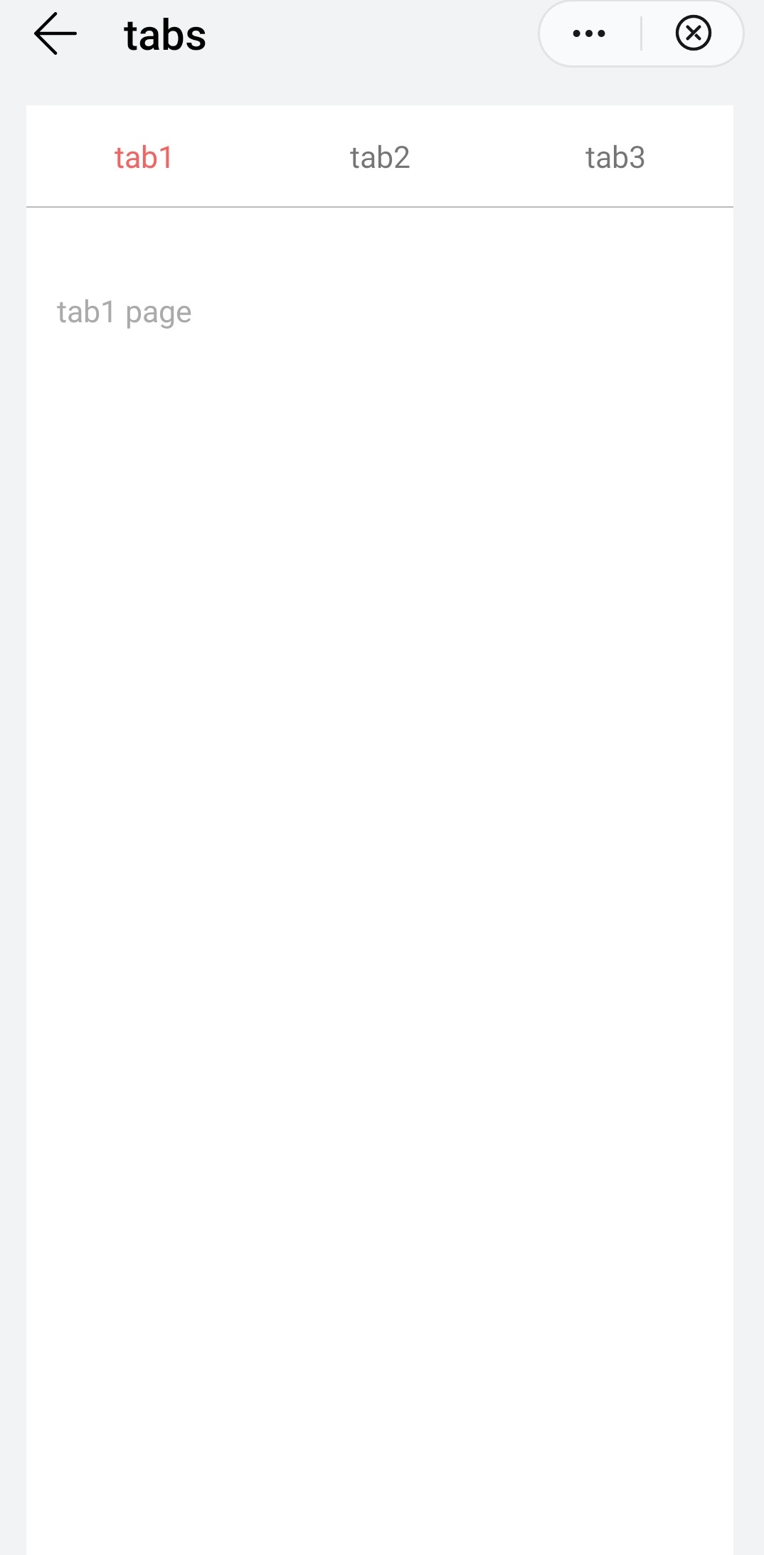
# Example
<template>
    <div class="container">
        <tabs class="tabs" onchange="changeTabactive" index="2">
            <tab-bar class="tab-bar">
                <text class="tab-text">tab1</text>
                <text class="tab-text">tab2</text>
                <text class="tab-text">tab3</text>
            </tab-bar>
            <tab-content class="tab-content" scrollable="{{scrollable}}">
                <div class="item-container">
                    <div class="item-content">
                        <text class="item-title">tab1 page</text>
                    </div>
                </div>
                <div class="item-container">
                    <div class="item-content">
                        <text class="item-title">tab2 page</text>
                    </div>
                </div>
                <div class="item-container">
                    <div class="item-content">
                        <text class="item-title">tab3 page</text>
                    </div>
                </div>
            </tab-content>
        </tabs>
    </div>
</template>


<style lang="sass">
   .tabs {
        flex: 1;
        margin-top: 20px;
        margin-right: 30px;
        margin-left: 30px;
        background-color: #ffffff;
    }
    .tab-content {
        flex: 1;
    }
    .tab-bar {
        height: 100px;
        border-color: #bbbbbb;
        color: #bbbbbb;
        border-bottom-width: 1px;
    }
    .tab-text {
        width: 300px;
        text-align: center;
    }
    .tab-text:active {
        color: #f76160;
    }
    .item-container {
        padding-top: 30px;
        padding-left: 30px;
        padding-right: 30px;
        flex-direction: column;
    }
    .item-content {
        flex-direction: column;
        padding-bottom: 30px;
    }
    .item-title {
        padding-top: 50px;
        padding-bottom: 20px;
        color: #aaaaaa;
    }
</style>
<script>
    export default {
        data: {
            scrollable: true,
        },
        changeTabactive: function (e) {
            // switch tab
            console.log('----------switch tab: ' + e.index);
        },
    }
</script>
← swiper tab-content →