# textarea
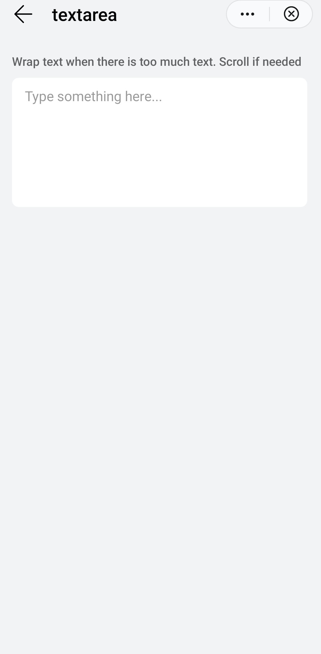
Multi-line text input control.
# Children Elements
This element doesn't support children elements.
# Attributes
In addition to the common attributes, this element may contain the following attributes.
# placeholder
Short textual hint that describes the expected value of the text area.
- Type:
string - Default value: -
- Mandatory: no
# maxlength
Numeric information that indicates the maximum number of characters of the input. The empty value indicates no specific limit.
- Type:
number - Default value: -
- Mandatory: no
# CSS Properties
In addition to the common styles, this element supports the following styling properties:
This element supports the :active pseudo-class.
# color
Color of the font.
- Type:
<color> - Default value:
rgba(0, 0, 0, 0.87) - Mandatory: no
# font-size
Font size.
- Type:
<length> - Default value:
37.5px - Mandatory: no
# font-weight
Weight of the font.
- Type:
string(lighter|100|200|300|400|500|600|700|800|900|normal|bold|bolder) - Default value:
normal - Mandatory: no
# placeholder-color
Color of the placeholder font.
- Type:
<color> - Default value:
rgba(0, 0, 0, 0.38) - Mandatory: no
# font-family
Font family of for the text.
- Type:
string - Default value: -
- Mandatory: no
To customize fonts, please refer font-face style.
# Events
In addition to the common events, this element supports following events.
# change
Event triggered when input text changes.
Additional parameters:
{ text: string }
# selectionchange
This event is triggered when the select() or setSelectionRange() methods are called in the textarea element to change the selected string.
# linechange
Event triggered when the number of lines in the text box changes.
Additional parameters:
{ height: number }. Theheightparameter indicates the text box height.{ lineCount: number }. ThelineCountparameter indicates the number of lines in the text box.
# Methods
This element has the following methods:
# focus({focus})
The event is triggered when an element gets/loses the focus.
Parameters:
objectwith the following attributes:focus: boolean(optional). Set/unset the focus (trueby default).
# select()
Selects all the text in a text box.
# setSelectionRange({start,end})
Select a specific text string in a text box.
Parameters:
objectwith the following attributes:start: number. Start position.end: number. End position.
# getSelectionRange({callback})
Gets the text selected in a text box.
Parameters:
objectwith the following attributes:callback : function(start : number, end : number).
# Force the Focus on the Element
You can force the focus status on an textarea element, using the public method focus(). This method triggers the focus event on this element.
This focus() method has a boolean argument that indicates whether the element is focused (true, value by default) or not (false).
Example:
this.$element('myElement').focus()
# Example
<template>
  <div class="container">
    <div class="case-title mt-item">
      <text class="title">Wrap text when there is too much text. Scroll if needed</text>
    </div>
    <div class="mlr-container">
      <textarea placeholder="Type something here..." class="textarea"></textarea>
    </div>
  </div>
</template>
← switch animations →