# slider
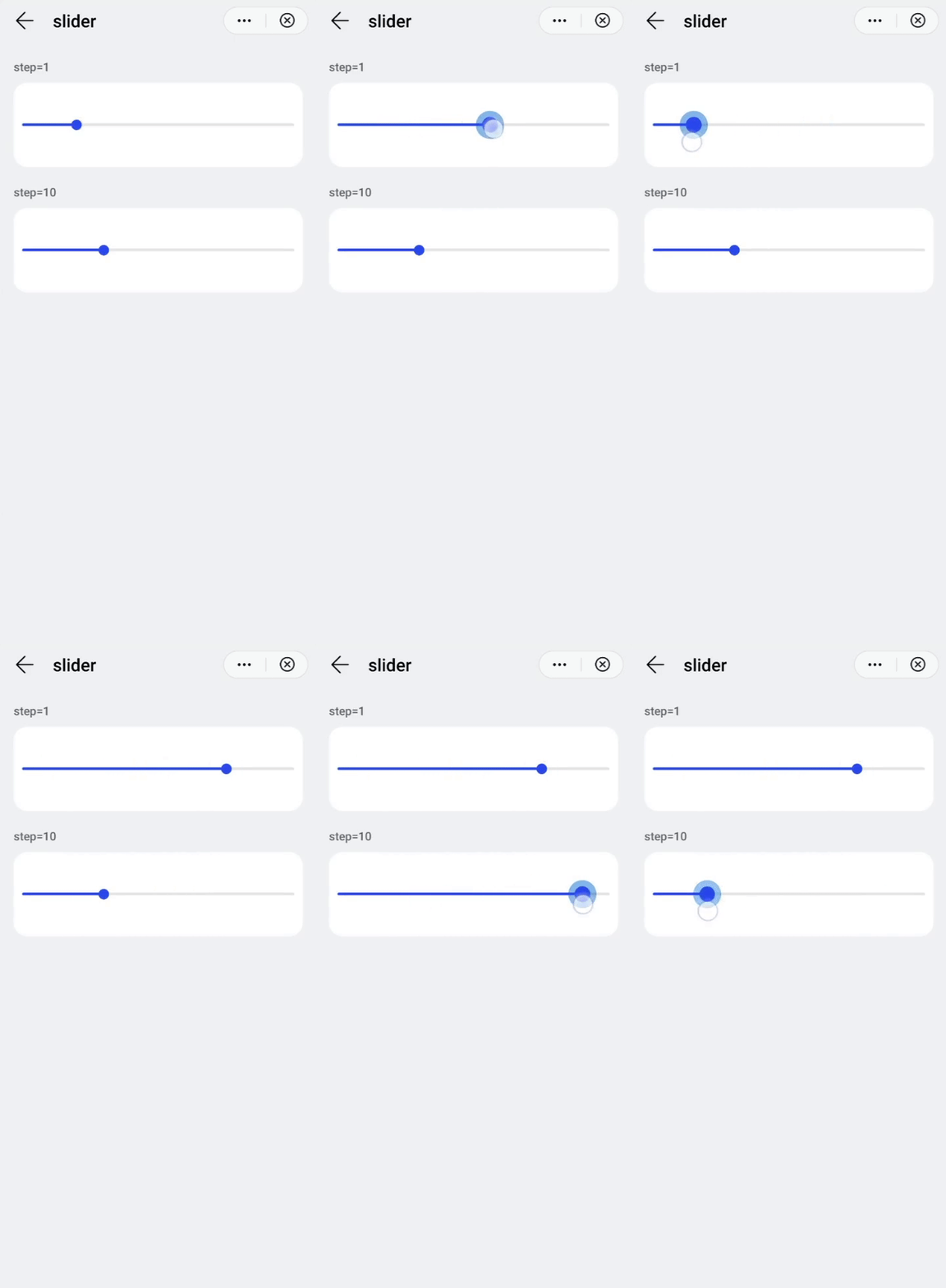
Numeric range slider selector as user input.
# Children Elements
This element doesn't support children elements.
# Attributes
In addition to the common attributes, this element may contain the following attributes.
# min
Minimum value that can be selected on a slider. Decimal values will be rounded off to integers.
- Type:
number - Default value:
0 - Mandatory: no
# max
Maximum value that can be selected on a slider. Decimal values will be rounded off to integers.
- Type:
number - Default value:
100 - Mandatory: no
# step
Intermediate steps between values to be selected in the slider. Decimal values will be rounded off to integers.
- Type:
number - Default value:
1 - Mandatory: no
# value
Current value selected in the slider. Decimal values will be rounded off to integers.
- Type:
number - Default value:
0 - Mandatory: no
# CSS Properties
In addition to the common styles, this element supports the following styling properties:
This element supports the :active pseudo-class.
# color
Bar color of the slider.
- Type:
<color> - Default value:
rgba(240,240,240,1.0) - Mandatory: no
# selected-color
Bar color of the active part of the slider (the selected range).
- Type:
<color> - Default value:
rgba(51,180,255,1.0) - Mandatory: no
# padding-[left|right]
The padding area on left and right sides of the slider.
- Type:
<length> - Default value:
32px - Mandatory: no
# block-color
Color of the slider handle.
- Type:
<color> - Default value: -
- Mandatory: no
# Events
This element supports the common events, with the exception of swipe. In addition to this, slider elements support the following event:
# change
This event is triggered when the current value of a slider changes.
Additional parameters:
{ progress: integer }
# Methods
This element does not have additional methods.
# Example
<template>
    <div class="container">
      <div class="case-title mt-item">
        <text class="title">step=1</text>
      </div>
      <div class="item-container slider-container fdir-column row-center">
        <slider class="slider" min="0" max="100" step="1" value="20"></slider>
      </div>
      <div class="case-title mt-item">
        <text class="title">step=10</text>
      </div>
      <div class="item-container slider-container fdir-column row-center">
        <slider class="slider" min="0" max="100" step="10" value="30"></slider>
      </div>
    </div>
</template>

<style lang="sass">
  .slider-container{
    height: 200px;
  }
</style>