# picker
Input element for selecting values of different nature, like text items, date, time, multi-column text.
Visit our repository (opens new window) and raise an issue (opens new window) if you want to contribute. Thanks you for your collaboration
# Children Elements
This element doesn't support children elements.
# Attributes
In addition to the common attributes, this element may contain the following attributes, depending on the type of picker, determined by the value of the attribute type (i.e., text, date, time, multi-text).
TIP
- Do not add spaces before or after the value of
type. Otherwise, the compilation will fail. - In a multi-column picker, each column must have data.
# text Picker Attributes
# range
List of textual values of the picker.
- Type:
array - Default value: -
- Mandatory: no
# selected
The index of the value selected in the picker.
- Type:
string - Default value:
0 - Mandatory: no
# value
Value selected in a picker.
- Type:
string - Default value: -
- Mandatory: no
# date Picker Attributes
# start
Start date of the picker, in the format yyyy-(M)M-dd.
- Type:
string(time) - Default value:
1970-1-1 - Mandatory: no
# end
End date of the picker, in the format yyyy-(M)M-dd.
- Type:
string(time) - Default value:
2100-12-31 - Mandatory: no
# selected
Current value selected in the picker (date), in the format yyyy-(M)M-(d)d.
- Type:
string - Default value: (current date)
- Mandatory: no
# value
Value selected in the picker.
- Type:
string - Default value: -
- Mandatory: no
# time Picker Attributes
# selected
Current value selected in the picker (time), in the format (h)h:(m)m.
- Type:
string - Default value: (current time)
- Mandatory: no
# value
Value selected in the picker.
- Type:
string - Default value: -
- Mandatory: no
# multi-text Picker Attributes
# range
List of textual values of the picker.
- Type:
array(two-dimension array) - Default value: -
- Mandatory: yes
# selected
Array with the indexes of the selected items in each column (e.g., [0,1,2,1]).
- Type:
array - Default value:
[0,0,0,0] - Mandatory: no
# value
Array with the values of the selected items in each column.
- Type:
string - Default value: -
- Mandatory: no
# Events
This element supports the common events, with the exception of swipe and click. In addition to this, picker elements support the following events:
# text Picker Events
# change
This event is triggered when the current value of the text picker changes.
Additional parameters:
{ newValue: string, newSelected: integer }
# date Picker Events
# change
This event is triggered when the current value of the date picker changes.
Additional parameters:
{ year: integer, month: integer, day: integer }(monthis a value in the[0..11]range).
# time Picker Events
# change
This event is triggered when the current value of the time picker changes.
Additional parameters:
{ hour:integer, minute:integer }
# date Picker Events
# multi-text
This event is triggered when the current value of the multi-text picker changes.
Additional parameters:
{ newValue:[string, string, string,...], newSelected: [integer, integer, integer...] }
# columnchange
This event is triggered when the current value of a multi-text changes.
Additional parameters:
{ column: integer, newValue: string, newSelected: integer}. Indicating the new column index, the selected value (text), and the index of the item selected in the row.
# cancel
This event is triggered when the user cancels the selection in a multi-text picker.
# Methods
This element has the following method:
# show()
This method displays the picker.
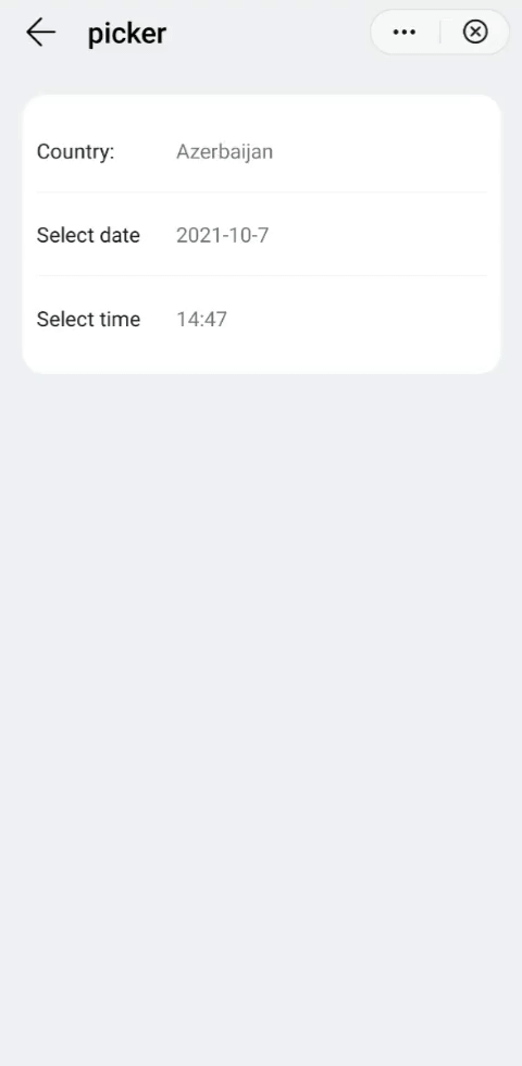
# Example
<template>
  <div class="container">
    <div class="item-container mt-item fdir-column">
      <div class="input-item divider-border-color border-bottom-1">
        <label class="label color-primary" target="picker-area">Country:</label>
        <picker class="picker" type="text" range="{{list}}" value="{{country}}" id="picker-area" onchange="countryChange"></picker>
      </div>
      <div class="input-item divider-border-color border-bottom-1">
        <label class="label color-primary" target="picker-date">Select date</label>
        <picker class="picker" type="date" value="{{date}}" id="picker-date" onchange="dateChange"></picker>
      </div>
      <div class="input-item">
        <label class="label color-primary" target="picker-time">Select time</label>
        <picker class="picker" type="time" value="{{time}}" id="picker-time" onchange="timeChange"></picker>
      </div>
    </div>
  </div>
</template>

<style lang="sass">
  .input-item{
    height: 120px;
    .label{
      flex-basis: 200px;
      flex-shrink:0;
    }
    .picker{
      width: 100%;
    }
  }
</style>

<script>
  const lessTenFormat = function(num){
    if(isNaN(num) || num < 0) return '';
    let newNum = Number(num);
    return newNum >= 10 ? newNum : `0${num}`
  }
  module.exports = {
    public: {
        list:[],
        country:'',
        date:'',
        time:'',
    },
    onInit: function () {
      this.$page.setTitleBar({ text: this.$t('message.component.picker.barTitle') });

      this.list = ['Afghanistan','Albania','Algeria','Andorra','Angola','Antigua and Barbuda','Argentina','Armenia','Australia','Austria','Azerbaijan','Bahamas','Bahrain','Bangladesh','Barbados','Belarus','Belgium','Belize','Benin','Bhutan','Bolivia','Bosnia and Herzegovina','Botswana','Brazil'];
      this.country = this.list[10];     // Selection by default

      let date = new Date();
      let Y = date.getFullYear();
      let M = date.getMonth() + 1;
      let D = date.getDate();
      let H = date.getHours();
      let m = date.getMinutes();
      this.date = Y + '-' + M + '-' + D;
      this.time = H + ':' + m;
    },
    dateChange({year,month,day}){
      this.date = `${year}-${lessTenFormat(month+1)}-${lessTenFormat(day)}`;
    },
    timeChange({hour,minute}){
      this.time = `${hour}:${lessTenFormat(minute)}`;
    },
    countryChange({newValue}){
      this.country = newValue;
    }
  }
</script>