# option
Options of a select drop-down list element.
# Children Elements
This element doesn't support children elements.
# Attributes
In addition to the common attributes, this element may contain the following attributes.
# selected
Flag that determines if the system must select the item by default in the select list.
- Type:
boolean - Default value: -
- Mandatory: no
# value
Unique value that identifies the option. This could be different than the information rendered to the user (e.g., <option value="fruit1">Lemon</option>)
- Type:
string - Default value: -
- Mandatory: yes
# CSS Properties
In addition to the common styles, this element supports the following styling properties:
# color
Color of the font.
- Type:
<color> - Default value:
0x8a000000 - Mandatory: no
# font-size
Font size.
- Type:
<length> - Default value:
30px - Mandatory: no
# font-weight
Weight of the font.
- Type:
string(lighter|100|200|300|400|500|600|700|800|900|normal|bold|bolder) - Default value:
normal - Mandatory: no
# text-decoration
Decoration options to the text.
- Type:
string(underline|line-through|none) - Default value:
none - Mandatory: no
# font-family
Font family of for the text.
- Type:
string - Default value: -
- Mandatory: no
To customize fonts, please refer font-face style.
# Events
This element doesn't support events.
# Methods
This element does not have additional methods.
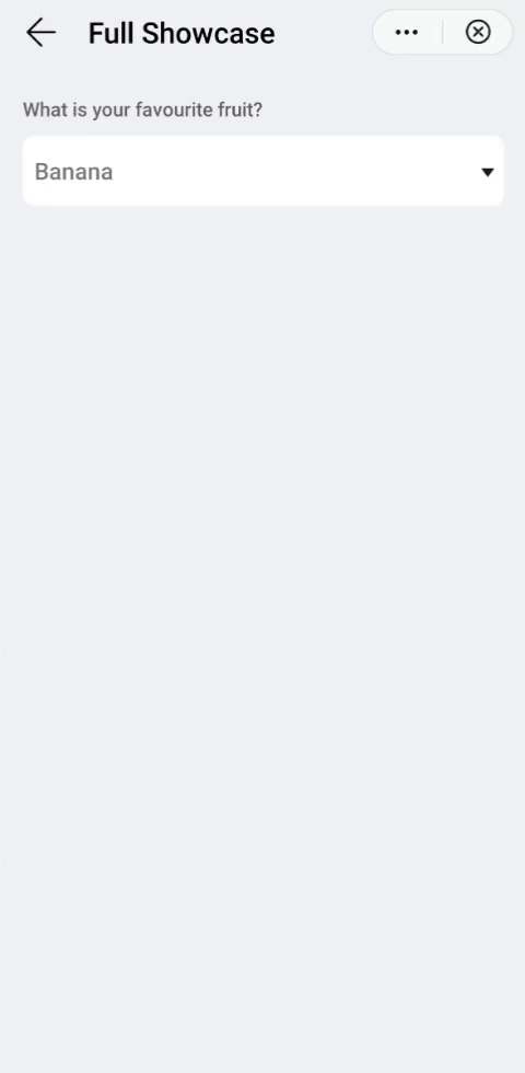
# Example
<template>
  <div class="container">
    <div class="case-title mt-item">
      <text class="title">What is your favourite fruit?</text>
    </div>
    <div class="mlr-container select-container bro-s">
      <select class="select">
        <option value="item1">Orange</option>
        <option value="item2" selected="true">Banana</option>
        <option value="item3">Lemon</option>
        <option value="item4">Strawberry</option>
        <option value="item5">Blueberry</option>
      </select>
    </div>
  </div>
</template>

<style lang="sass">
  .select-container{
    background-color: #fff;
    padding-right: 14px;
  }
  .select{
    width: 100%;
    height: 100px;
  }
</style>