# input
User input control.
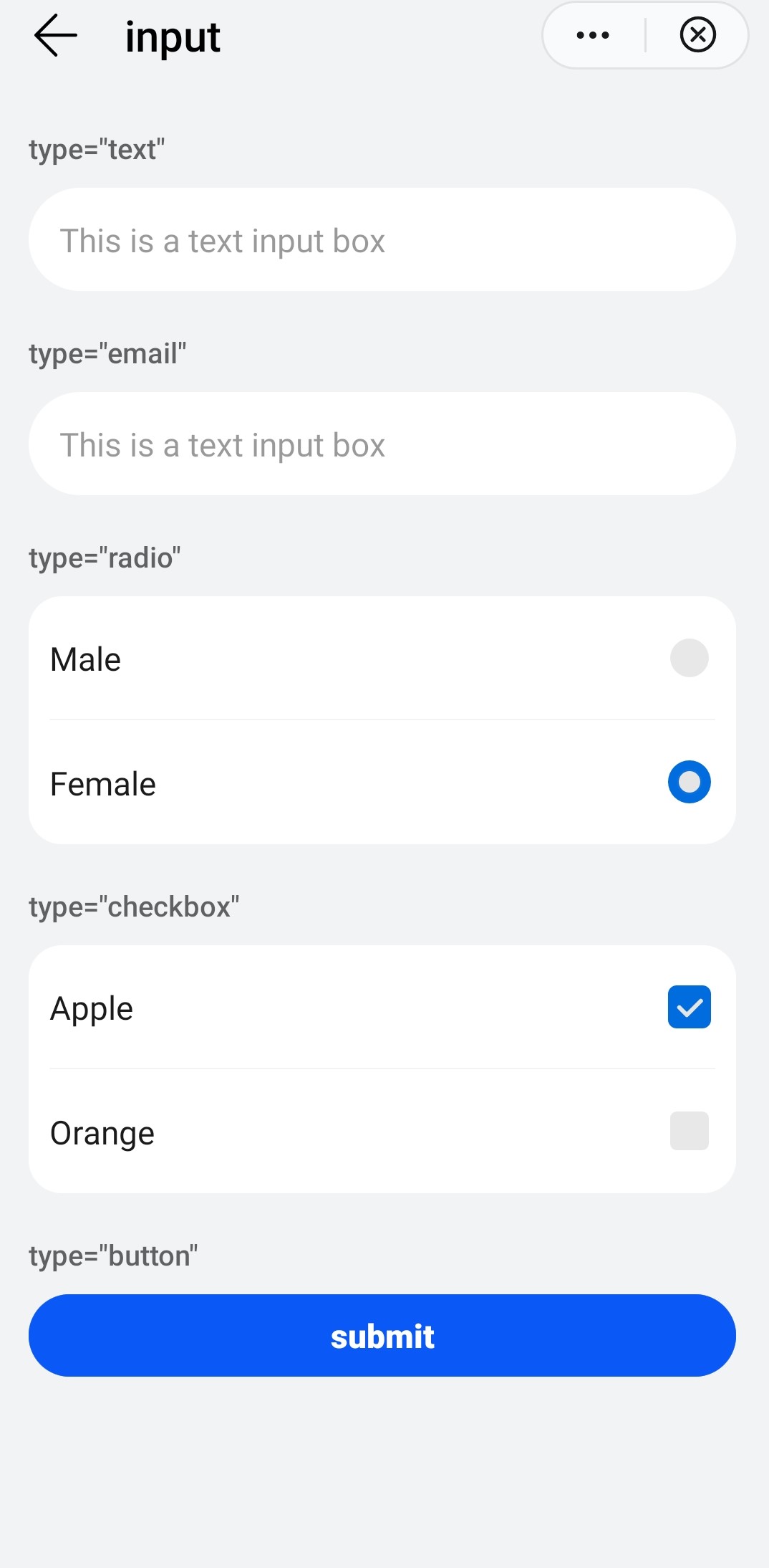
# Children Elements
This element doesn't support children elements.
# Attributes
In addition to the common attributes, this element may contain the following attributes.
# type
Type of the input control. It can be modified dynamically.
- Type:
string(button|checkbox|radio|text|email|date|time|number|password) - Default value:
input - Mandatory: no
# checked
This attribute indicates if a checkbox-typed input is selected or not. The setting activate the :checked pseudo-class.
- Type:
boolean - Default value:
false - Mandatory: no
# name
Name of the input element.
- Type:
string - Default value: -
- Mandatory: no
# value
Current value of the input element.
- Type:
string - Default value: -
- Mandatory: no
# placeholder
Placeholder content of the input control when the type is text, email, date, time, number, or password.
- Type:
string - Default value: -
- Mandatory: no
# maxlength
Maximum number of characters allowed in an input box. An empty value indicates no limit.
- Type:
number - Default value: -
- Mandatory: no
# enterkeytype
Display label of the Enter button on the soft keyboard.
- Type:
string(default|next|go|done|send|search| - Default value:
default - Mandatory: no
# CSS Properties
In addition to the common styles, this element supports the following styling properties:
This element supports the :active pseudo-class.
# color
Color of the font.
- Type:
<color> - Default value:
rgba(0,0,0,0.87) - Mandatory: no
# font-size
Font size.
- Type:
<length> - Default value:
37.5px - Mandatory: no
# placeholder-color
Color of the placeholder text color.
- Type:
<color> - Default value:
rgba(0,0,0,0.38) - Mandatory: no
# font-weight
Weight of the font.
- Type:
string(lighter|100|200|300|400|500|600|700|800|900|normal|bold|bolder) - Default value:
normal - Mandatory: no
# width
Width of the input field.
- Type:
<length-percentage> - Default value: -
- Mandatory: no
TIP
The default value is 128px when type is button.
# height
Height of the input field.
- Type:
<length-percentage> - Default value: -
- Mandatory: no
TIP
The default value is 70px when type is button.
# font-family
Font family of for the text.
- Type:
string - Default value: -
- Mandatory: no
To customize fonts, please refer font-face style.
# caret-color
Color of the cursor.
- Type:
string(color|transparent|auto) - Default value:
auto - Mandatory: no
# Events
In addition to the common events, this element supports following events.
# change
Event triggered when checked or value changes.
Additional parameters:
{ name: string }. Applicable whentypeischeckboxorradio.{ value: string }. Applicable whentypeistext,email,date,time,number,password,checkboxorradio.{ checked: boolean }. Applicable whentypeischeckbox.
WARNING
You can get current value of an input element through evt.value in the change event (when type is checkbox, radio, text, email, date, time, number, or password).
The value cannot be obtained through this.$element('ID').value.
# enterkeyclick
This event is triggered when the user presses the Enter key on the soft keyboard.
Additional parameters:
{ value: string }
# selectionchange
This event is triggered when the select() or setSelectionRange() methods are called in the input element to change the selected string.
This event applies only to the scenario where the input element type is text, email, date, time, or number.
# Methods
This element has the following methods:
# focus({focus})
The event is triggered when an element gets/loses the focus.
Parameters:
objectwith the following attributes:focus: boolean(optional). Set/unset the focus (trueby default).
# select()
Selects all the text in a text input.
# setSelectionRange({start,end})
Select a specific text string in a text input.
Parameters:
objectwith the following attributes:start: number. Start position.end: number. End position.
# getSelectionRange({callback})
Gets the text selected in a text input.
Parameters:
objectwith the following attributes:callback : function(start : number, end : number).
# Force the Focus on the Element
You can force the focus status on an input element, using the public method focus(). This method triggers the focus event on this element.
This focus() method has a boolean argument that indicates whether the element is focused (true, value by default) or not (false).
Example:
this.$element('myElement').focus()
# Example
<template>
  <div class="container">
    <div class="case-title mt-item">
      <text class="title">type="text"</text>
    </div>
    <div class="mlr-container">
      <input id="textInput" placeholder="This is a text input box" class="input-big" enterkeytype="next" />
    </div>
    <div class="case-title mt-item">
      <text class="title">type="email"</text>
    </div>
    <div class="mlr-container">
      <input type="email" placeholder="This is a text input box" class="input-big" enterkeytype="done" />
    </div>
    <div class="case-title mt-item">
      <text class="title">type="radio"</text>
    </div>
    <div class="info-container">
      <div class="info-item border-bottom-1">
        <label target="male" class="title">Male</label>
        <div class="result">
          <input class="radio" type="radio" id="male" name="gender" />
        </div>
      </div>
      <div class="info-item">
        <label target="female" class="title">Female</label>
        <div class="result">
          <input class="radio" type="radio" id="female" name="gender" />
        </div>
      </div>
    </div>
    <div class="case-title mt-item">
      <text class="title">type="checkbox"</text>
    </div>
    <div class="info-container">
      <div class="info-item border-bottom-1">
        <label target="apple" class="title">Apple</label>
        <div class="result">
          <input class="checkbox" type="checkbox" id="apple" name="fruit" />
        </div>
      </div>
      <div class="info-item">
        <label target="orange" class="title">Orange</label>
        <div class="result">
          <input class="radio" type="checkbox" id="orange" name="fruit" />
        </div>
      </div>
    </div>
    <div class="case-title mt-item">
      <text class="title">type="button"</text>
    </div>
    <div class="mlr-container row-center">
      <input type="button" class="btn-blue" value="submit" />
    </div>
  </div>
</template>

<script>
  module.exports = {
    onShow(options) {
      this.$element('textInput').focus();
    },
  }
</script>
ººº