# div
Defines a generic block.
# Children Elements
This element may support any children elements.
# Attributes
This element may contain the common attributes.
WARNING
A div element as a root element cannot contain if or show attributes. You can add an auxiliary block or a div sub-element for that purpose.
# CSS Properties
In addition to the common styles, this element supports the following styling properties:
This element supports the :active pseudo-class.
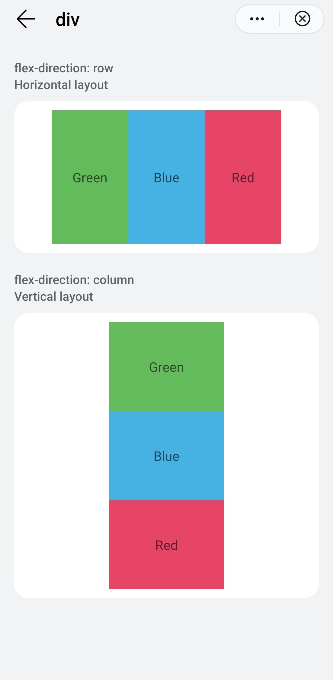
# flex-direction
Direction of the distribution of elements in the flex container.
- Type:
string(column|row|row-reverse|column-reverse) - Default value:
row - Mandatory: no
# flex-wrap
It specifies whether flex items are forced into a single line or can be wrapped onto multiple lines.
- Type:
string(nowrap|wrap|wrap-reverse) - Default value:
nowrap - Mandatory: no
# justify-content
It defines how the space between and around content items is distributed within a flex container.
- Type:
string(flex-start|flex-end|center|space-between|space-around) - Default value:
flex-start - Mandatory: no
# align-items
It indicates how the space between and around flex items is distributed within a flex container.
- Type:
string(stretch|flex-start|flex-end|center) - Default value:
stretch - Mandatory: no
# align-self
It aligns flex items of the current flex container, overriding the align-items value.
- Type:
string(auto|stretch|center|flex-start|flex-end) - Default value:
auto - Mandatory: no
# align-content
It aligns a flex container's lines within the flex container.
- Type:
string(stretch|flex-start|flex-end|center|space-between|space-around) - Default value:
stretch - Mandatory: no
# Events
This element supports the common events.
WARNING
When the div element contains a web element as a child, the swipe event in the div cannot be triggered.
# Methods
This element does not have additional methods.
# Example
<template>
  <div class="container">
    <div class="case-title mt-item">
      <text class="title">flex-direction: row</text>
      <text class="title">Horizontal layout</text>
    </div>
    <div class="item-container">
      <div class="flex-row-container">
        <div class="row-item bg-green"><text>Green</text></div>
        <div class="row-item bg-blue"><text>Blue</text></div>
        <div class="row-item bg-red"><text>Red</text></div>
      </div>
    </div>
    <div class="case-title mt-item">
        <text class="title">flex-direction: column</text>
        <text class="title">Vertical layout</text>
      </div>
    <div class="item-container">
      <div class="flex-column-container">
        <div class="row-item bg-green"><text>Green</text></div>
        <div class="row-item bg-blue"><text>Blue</text></div>
        <div class="row-item bg-red"><text>Red</text></div>
      </div>
    </div>
  </div>
</template>

<style lang="sass">
  @import '../../../Common/css/common.scss';
  .flex-row-container {
    margin: 0 auto;
    width: 80%;
    height: 300px;
    flex-direction: row;
    .row-item {
      flex: 1;
      height: 100%;
      justify-content: center;
    }
  }
  .flex-column-container {
    margin: 0 auto;
    width: 40%;
    height: 600px;
    flex-direction: column;
    .row-item {
      flex: 1;
      justify-content: center;
    }
  }
</style>

<script>
  module.exports = {
    data: {
    },
  }
</script>